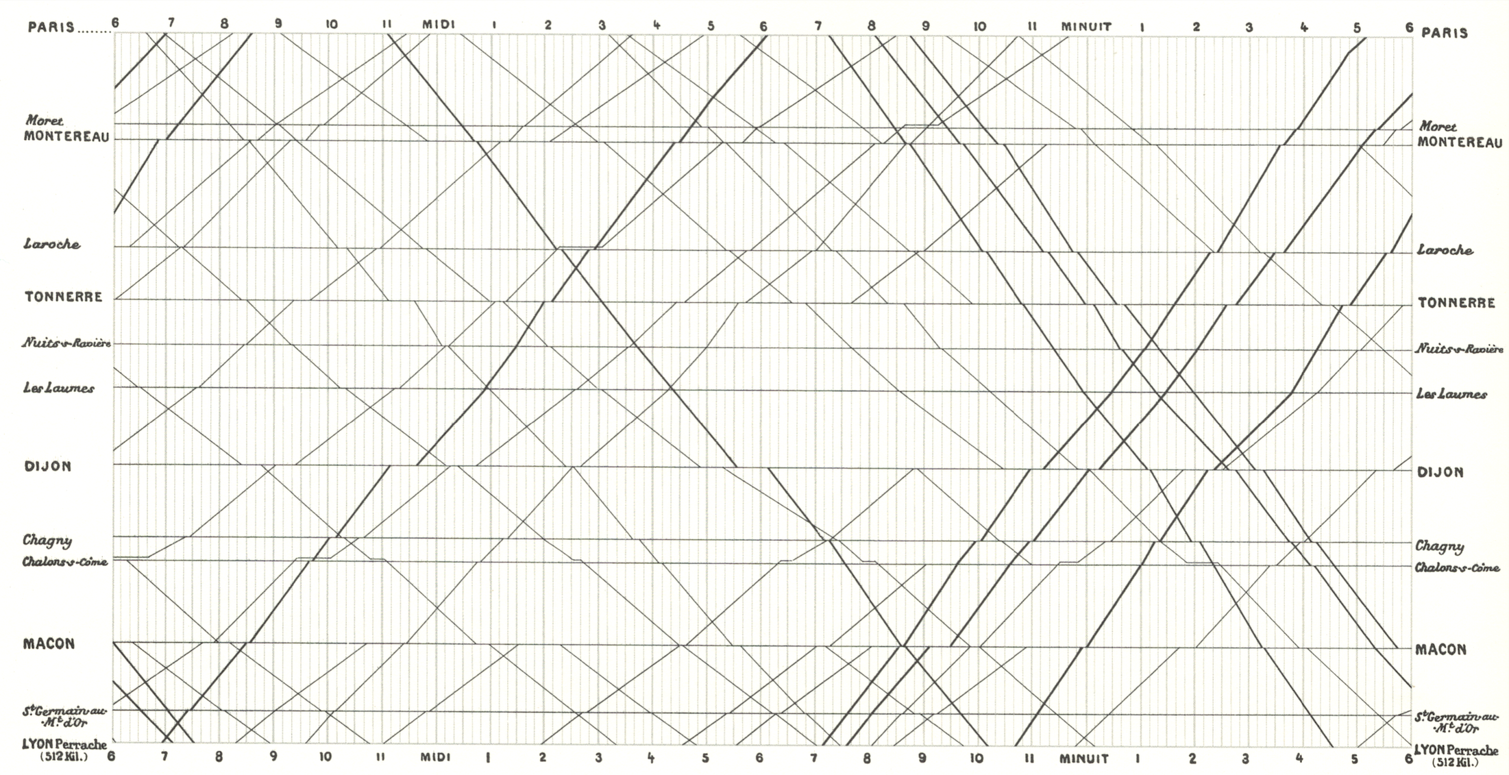
import pandas as pd
import plotly.graph_objects as go
from datetime import datetime

# -------- Example station list with approximate distances --------
stations = [
    ("Paris", 0),
    ("Melun", 50),
    ("Montereau", 80),
    ("Sens", 115),
    ("Montargis", 150),
    ("Nevers", 270),
    ("Moulins", 350),
    ("Roanne", 480),
    ("Lyon", 465)
]

stations_df = pd.DataFrame(stations, columns=["station", "distance_km"])
dist_map = stations_df.set_index("station")["distance_km"].to_dict()

# ---------- Example timetable data (synthetic, Marey-style) ----------
trains = {
    "Express 1": [("Paris", "06:00"), ("Melun", "06:45"), ("Sens", "07:40"),
                  ("Nevers", "09:30"), ("Lyon", "12:00")],
    "Local A":   [("Paris", "06:20"), ("Melun", "07:10"), ("Montereau", "07:40"),
                  ("Montargis", "08:50"), ("Moulins", "11:45"), ("Lyon", "15:00")],
    "Express 2": [("Paris", "07:00"), ("Melun", "07:40"), ("Sens", "08:25"),
                  ("Nevers", "10:00"), ("Lyon", "12:30")],
    "Freight":   [("Paris", "05:30"), ("Melun", "06:40"), ("Montereau", "07:30"),
                  ("Montargis", "09:05"), ("Roanne", "13:00")],
    "Return 1":  [("Lyon", "07:10"), ("Roanne", "08:40"), ("Moulins", "10:50"),
                  ("Nevers", "12:05"), ("Paris", "15:30")]
}

# -------- Flatten timetable into a dataframe --------
records = []
for train, stops in trains.items():
    for station, time_str in stops:
        if station not in dist_map:
            continue
        hh, mm = map(int, time_str.split(":"))
        t = datetime(1880, 6, 1, hh, mm)  # example date
        records.append({
            "train": train,
            "station": station,
            "time": t,
            "distance_km": dist_map[station]
        })

df = pd.DataFrame(records)

# -------- Create Plotly figure --------
fig = go.Figure()

for train, g in df.groupby("train"):
    g_sorted = g.sort_values("time")
    fig.add_trace(go.Scatter(
        x=g_sorted["time"],
        y=g_sorted["distance_km"],
        mode="lines+markers",
        name=train,
        hovertemplate="<b>%{text}</b><br><br>Time: %{x}<br>Distance: %{y} km",
        text=[train]*len(g_sorted)
    ))

# -------- Add horizontal station lines --------
for _, row in stations_df.iterrows():
    fig.add_shape(
        type="line",
        x0=df["time"].min(),
        x1=df["time"].max(),
        y0=row["distance_km"],
        y1=row["distance_km"],
        line=dict(color="lightgray", width=1, dash="dot")
    )
    fig.add_annotation(
        x=df["time"].min(),
        y=row["distance_km"],
        text=row["station"],
        showarrow=False,
        xanchor="right",
        yanchor="middle",
        xshift=-10
    )

# -------- Layout styling --------
fig.update_layout(
    title="Gráfico de Marey — Paris ⇄ Lyon (fictício)",
    xaxis_title="Hora do dia",
    yaxis_title="Distância desde Paris (km)",
    yaxis=dict(autorange="reversed"),  # Paris on top, Lyon at bottom
    hovermode="closest",
    template="plotly_white",
    height=700
)

fig